Component-Based Architecture
Built with modular UI structures ensuring consistent product grids, card behaviors, and reusable components.
Design + Engineering Case Study
A premium e-commerce experience designed to make the brand feel as considered online as it does in the physical world.
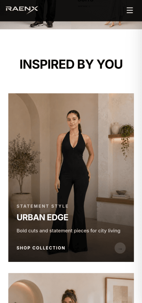
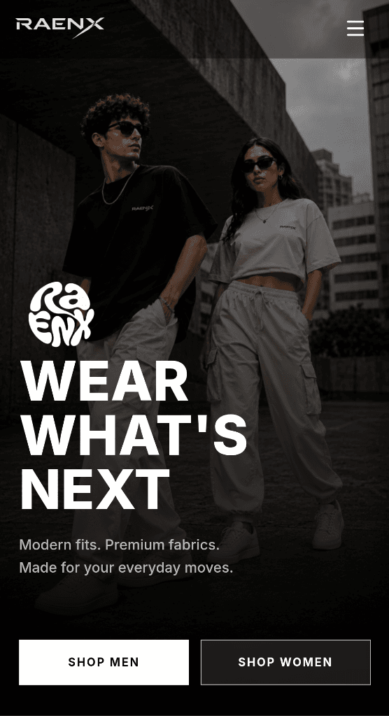
RAENX is a fashion brand built around a modern, premium aesthetic. But building a fashion storefront online is not simply a matter of displaying products.
The website has to do several jobs at once. It has to communicate the brand. It has to make products desirable. It has to help people discover what they want. And when someone decides to buy, the experience needs to become almost invisible.
That balance became the core design challenge behind RAENX.
A fashion store has to sell the product before the checkout.
Online fashion is unusually visual. Customers cannot touch the fabric. They cannot try the fit. They cannot walk around a physical store and discover something unexpectedly. The website has to compensate for that.
Every image, type treatment, spacing decision, product card, category and interaction contributes to whether the brand feels premium or forgettable. The challenge was to create a storefront that could feel editorial and aspirational without sacrificing the clarity required for e-commerce.
The website needed a recognizable visual identity rather than feeling like a generic online store.
Products needed to remain the primary visual focus of every screen.
Visitors needed clear paths into categories, collections, and trending products.
Shopping information such as shipping, returns, secure checkout, and COD needed to remain accessible.
The visual experience could not become so experimental that it made shopping difficult.
The experience needed to remain strong on smaller screens where modern commerce traffic happens.
Turn the storefront into part of the brand.
Instead of treating the website as a catalogue, I approached it as an extension of the RAENX brand. The goal was to make the interface feel closer to a fashion editorial than a conventional online store while keeping the underlying shopping experience familiar.
VISUAL CONFIDENCE.
COMMERCE CLARITY.
Minimal. Modern. Intentional.
Fashion websites can easily become visually overloaded. Too many banners. Too many badges. Too many competing calls to action.
For RAENX, the interface needed restraint. The product should create the visual interest the interface should support it.
Make browsing feel effortless.
Fashion shoppers rarely arrive with a perfectly defined purchase in mind. Sometimes they know exactly what they want. Sometimes they simply want to browse. The experience therefore needs to support both behaviors.
For RAENX, navigation was designed around recognizable categories and visual product discovery so visitors can move from inspiration to product without unnecessary friction.
The product is the interface.
The most important element on a fashion store is not the button. It is the product. The interface therefore needs to give product imagery enough space to breathe while providing the information required to make a decision.
Detailed close-ups highlighting fabric texture and fit.
Clear pricing and size availability presented without clutter.
Subtle typography guiding focus naturally to key product details.
Direct add-to-bag actions designed for effortless checkout.
Premium doesn't mean mysterious.
A premium visual experience still needs to answer practical questions. Reassurance signals reduce customer uncertainty during decision-making.
The visual language creates desire. The trust layer creates confidence. Both are necessary.
From discovery to decision.
The storefront has to work everywhere.
Fashion discovery does not happen on one screen. A visitor might discover RAENX on a phone, browse products on a laptop, and return later from another device. The experience therefore needs to preserve the same visual hierarchy across screen sizes.
Design is only half the problem.
An e-commerce interface can look impressive in a static design file. The real challenge begins when the interface has to work reliably under real user conditions.
Built with modular UI structures ensuring consistent product grids, card behaviors, and reusable components.
Optimized image loading and responsive media scaling to deliver fast initial page loads on mobile networks.
Smooth transitions for navigation drawer, product views, and category filtering.
Clean separation of design tokens, structural layouts, and responsive breakpoints.
Consistency creates the feeling of quality.
A premium e-commerce experience depends on structural consistency across typography, grid spacing, buttons, product cards, category labels, and interaction states.
A storefront that feels like RAENX.
The result is not simply a website that can sell clothing. It is a digital storefront designed to communicate what RAENX is before the customer ever reaches checkout.
Products remain the focus. Navigation remains clear. Trust signals remain visible. And the visual language creates a stronger connection between the brand and the shopping experience.
Good e-commerce design is a balancing act.
One of the biggest lessons from RAENX was that premium design and usability are not competing goals. The best experience is where they reinforce each other.
The interface should support the product rather than compete with it.
Every unnecessary interaction is another opportunity for a visitor to leave.
Visual quality creates interest. Clear information creates confidence.
“RAENX started as an e-commerce website.
The goal was to turn it into a brand experience.”
Because the best storefronts don't just help people buy.
They make people want to stay.